 UX/UI
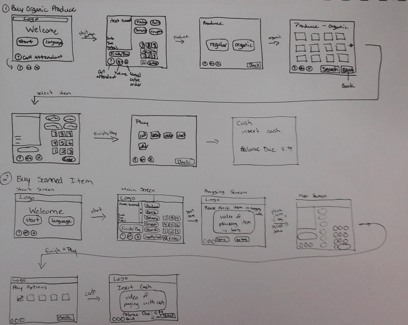
UX/UIThis conceptual project is a design of a self-checkout in a grocery store. I began by looking at current self-checkouts and made a list of the pros and cons of each one. After, I sketched out different user interfaces to find the one that would provide the best user experience. Once I had a good interface design, I created a clickable prototype and gathered user research based on my design to help improve it. Overall, I created an interface that will provide the user with a good experience and will not frustrate them.
All photos are for conceptual use only.
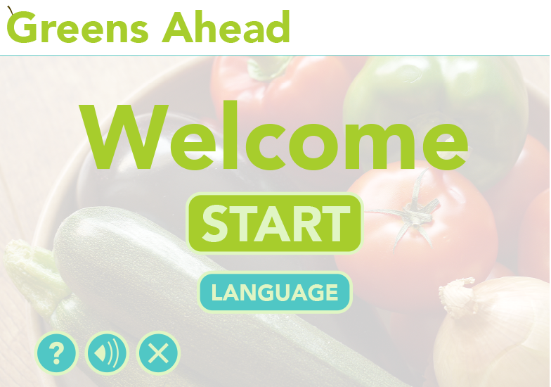
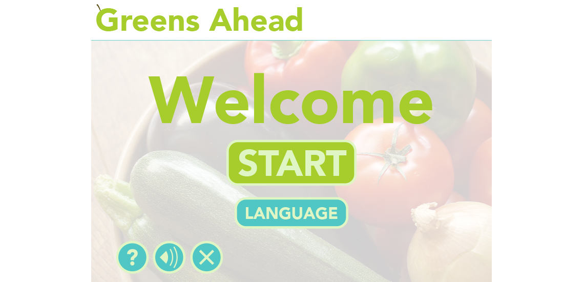
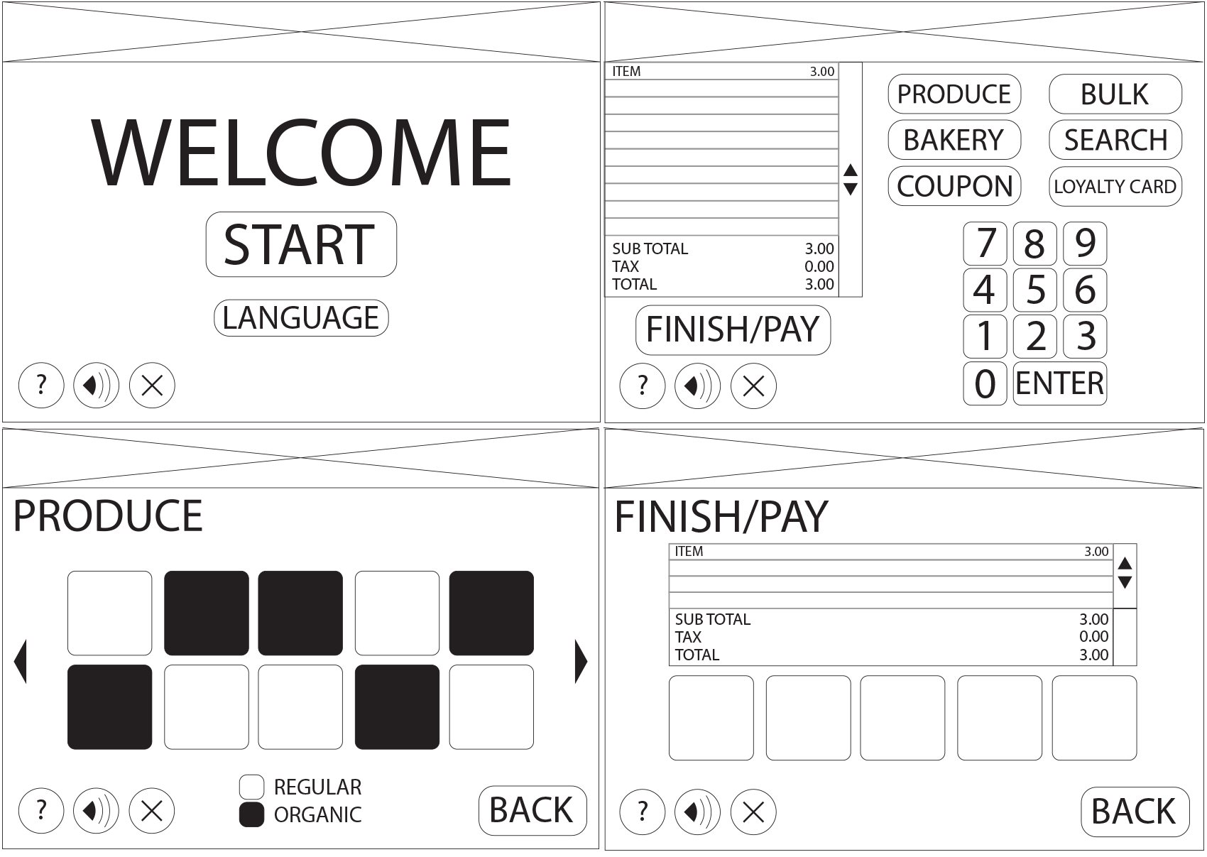
Start Page
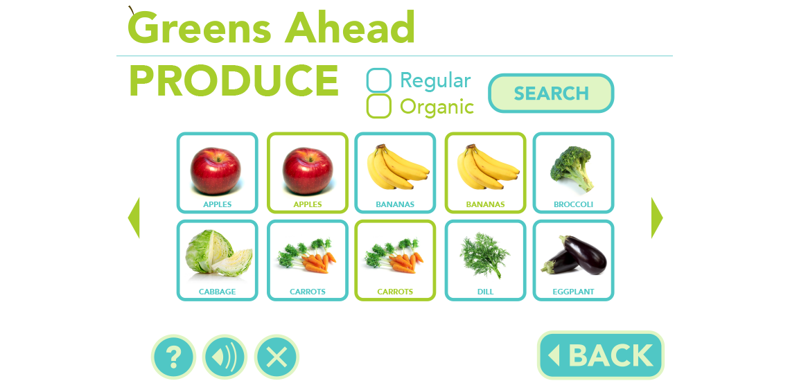
Produce Page
Main Page
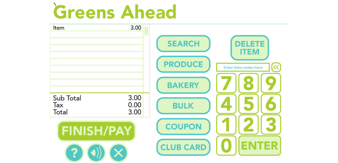
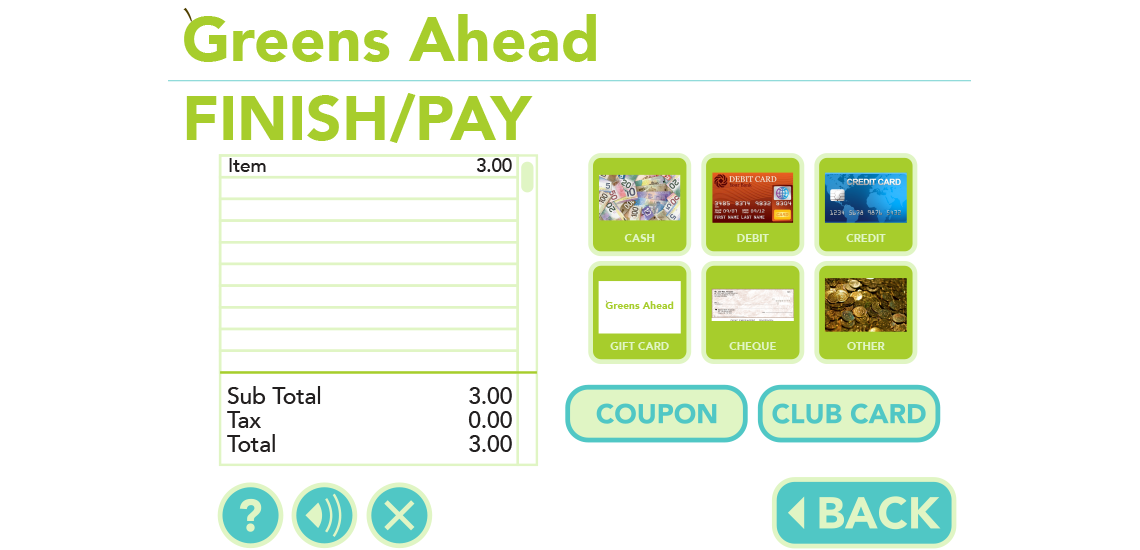
Pay Page
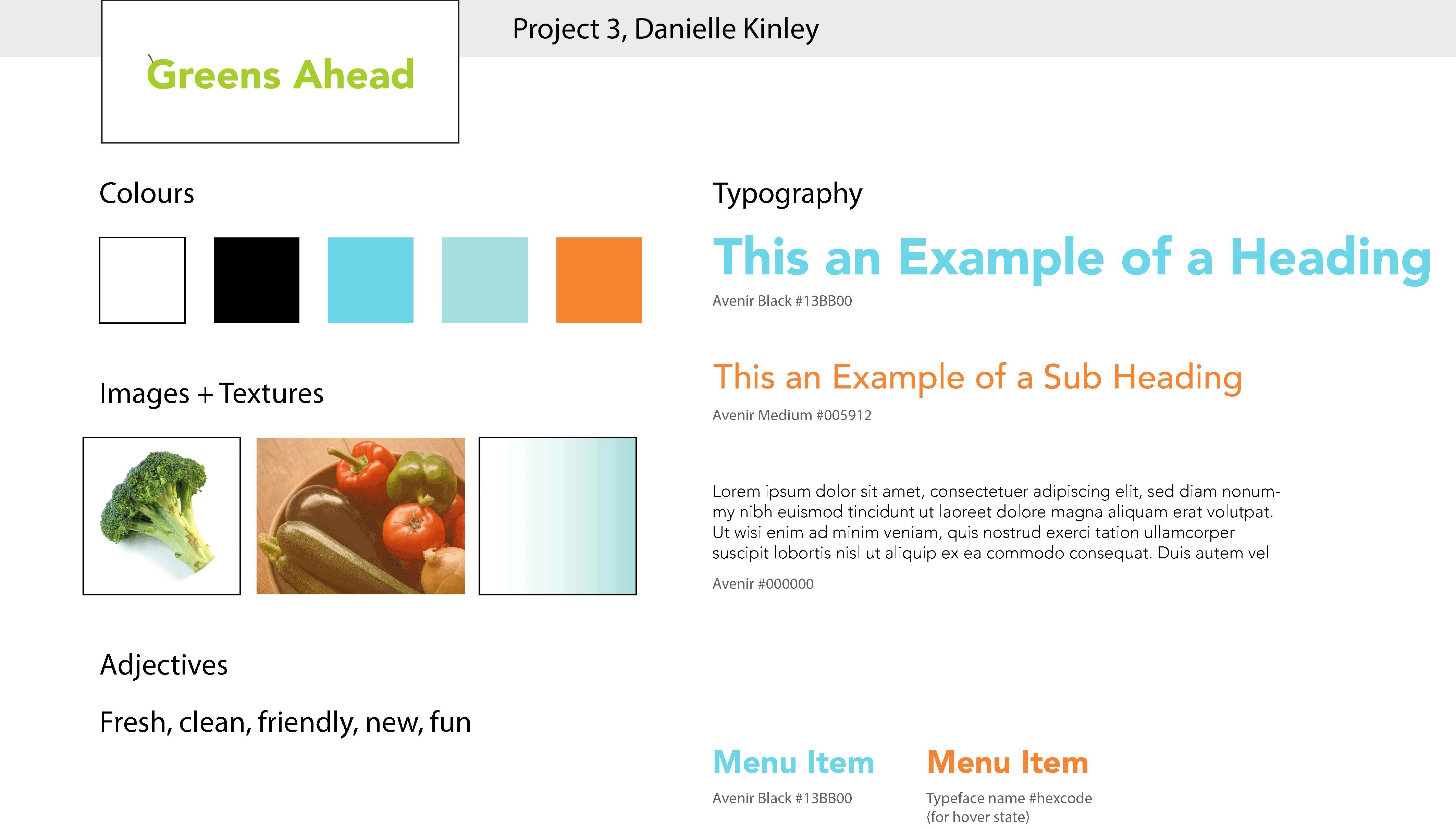
The research conducted at the beginning of this project included a competitor analysis of existing self check-outs. At the end of the analysis, I discovered that Save On Foods had the best system, because the buttons were clearly labeled and large enough to clearly read. In my design, I created large easy to read buttons to accommodate all ages of users. After the competitor analysis, I created user experience sketches to figure out the kinds of screens to include in my design. I also used this process to create as few steps as possible for each task, making a more user friendly experience. Lastly, I created wireframes and styletiles to better organize and display the information, and make a visually appealing style that will also help create a hierarchy of information.
UX Sketches
Wireframes
Styletile 1
Styletile 2
Styletile 3