 UX/UI
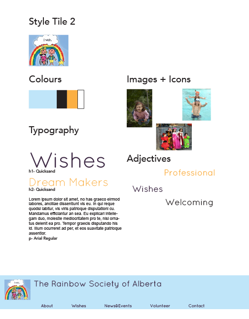
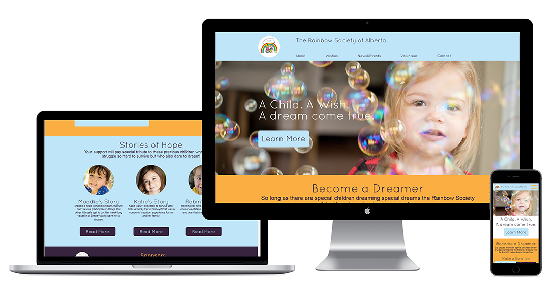
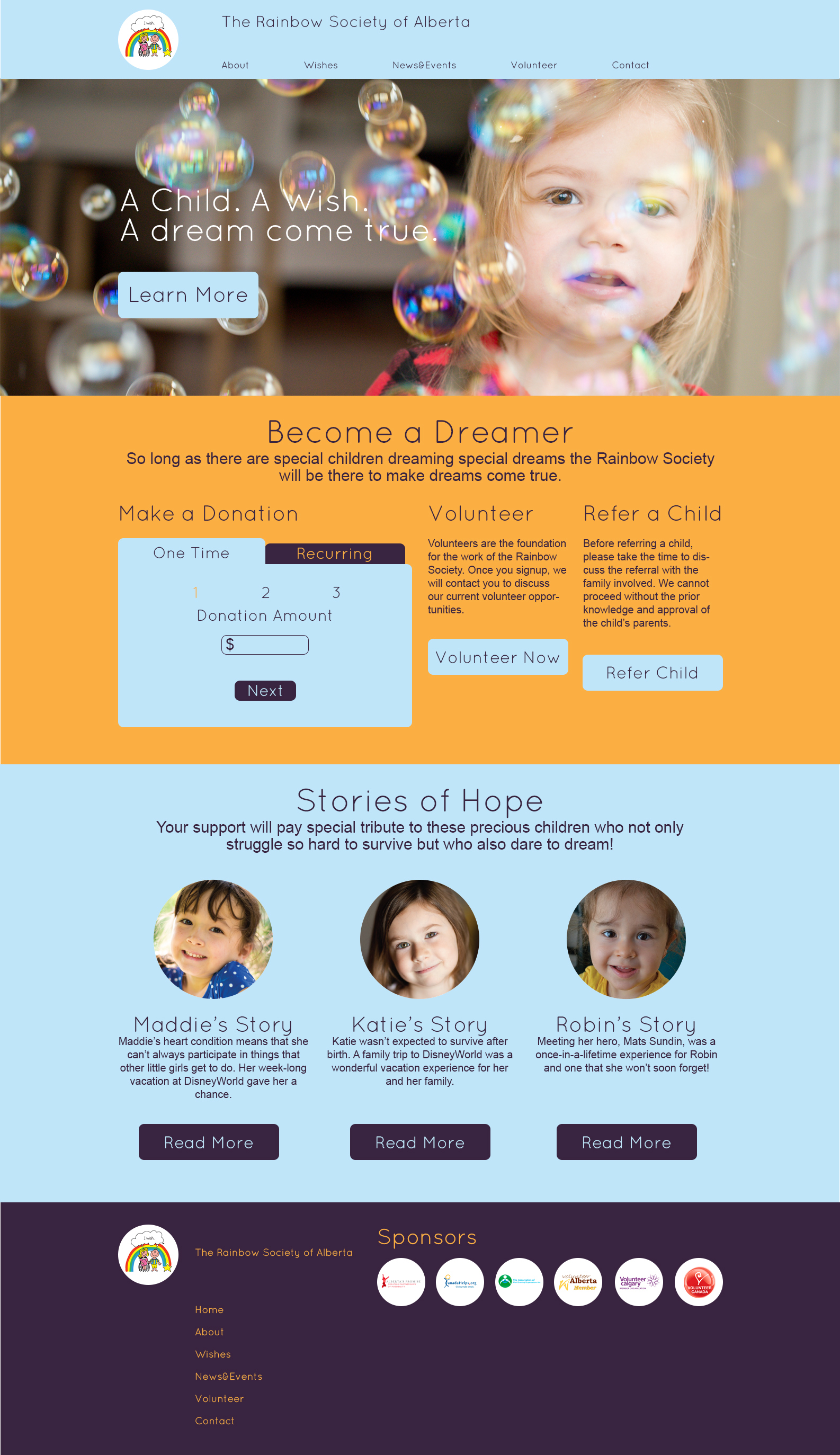
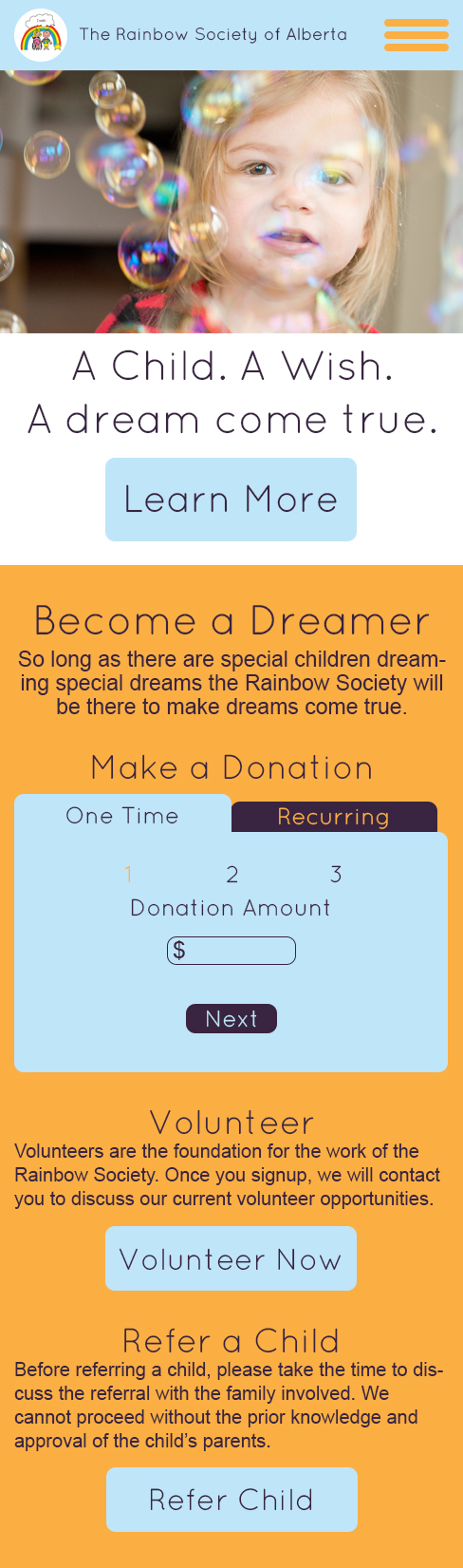
UX/UIThis is a conceptual redesign project for The Rainbow Society website. I was provided with the wireframes and only designed the style and look of the site. I started by researching the organization to gain a better understanding of their brand and the sites possible users. Next I created a few styletiles to help find the tone that would best represent the organization and appeal to the site’s users. I chose the blue and yellow to represent the sky and dreams of a child. The colours, type, and image choices also help the site seem more welcoming and professional. Overall the style choices help enhance the site and highlight the important elements on the home page.
All photos are for conceptual use only.
Desktop Home Page
Mobile Home Page
The preliminary research that was conducted for this project included defining the organization and its target audience. I learned that the main target audience of the organization would be the sponsors, and as a result, I created a design that is both professional and kid friendly. The styletiles helped to narrow down the aesthetic choices and create a cohesive style to effectively represent the brand.
Styletile